Turbo Chart Webinar - Transmission Lines Highlights
In this highlight video, we will discuss and demonstrate an example of a power transmission lines project using Turbo-Chart. Take a look to learn how to pull your data from Primavera P6 into Turbo-Chart, switch logic, switch durations, and understand how Turbo-Chart can help you with modelling your projects.
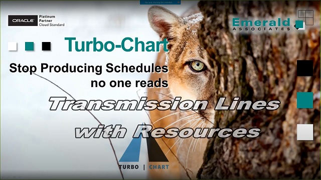
Turbo-Chart is a data visualization tool that allows for the linear schedule visualization of Primavera P6 and Microsoft Project data. Turbo-Chart pulls the tasks, dates, user-defined fields and codes from P6 directly using Web Services. Turbo-Chart integrates with many different data analysis platforms as well, allowing you to see different types of data side-by-side with Turbo-Chart. With a wide range of interactive chart types, Turbo-Chart enables you to generate your charts quickly and efficiently and tell the story more clearly than a multi-page Gantt chart. When a Gantt chart does not really get the message across for the workflow and geography that the project is tackling, Turbo-Chart can really enhance the communication of any physical conflicts that can arise on the site. Turbo-Chart grabs your dates, tasks, and UDF fields for geo-location. It then graphs the work, and the user can edit colors, hatching, etc. to get a visual that improves planning.
Turbo-Chart is a data visualization tool that allows for the linear schedule visualization of Primavera P6 and Microsoft Project data. Turbo-Chart pulls the tasks, dates, user-defined fields and codes from P6 directly using Web Services. Turbo-Chart integrates with many different data analysis platforms as well, allowing you to see different types of data side-by-side with Turbo-Chart. With a wide range of interactive chart types, Turbo-Chart enables you to generate your charts quickly and efficiently and tell the story more clearly than a multi-page Gantt chart. When a Gantt chart does not really get the message across for the workflow and geography that the project is tackling, Turbo-Chart can really enhance the communication of any physical conflicts that can arise on the site. Turbo-Chart grabs your dates, tasks, and UDF fields for geo-location. It then graphs the work, and the user can edit colors, hatching, etc. to get a visual that improves planning.
